


If you know me, you know I’m pretty nerdy! When I heard that the first Windows 11 insider build dropped today (22000.51), I immediately dug out my test machine and put that sucker on the Dev channel! In this post, I’ll share my first thoughts on my first couple minutes tinkering with the Next Generation of Windows.
Immediate Impressions
First thing’s first, this beautiful user interface! After the lengthy update (understandable), I was greeted by a much-improved lock screen. It’s just… more appealing to look at I suppose. Once I authenticated, I was greeted by the new taskbar, but more on that in a sec. Now, my Microsoft Accounts pulled down my own theme settings. Those had to go! So, I chose the built in dark theme:
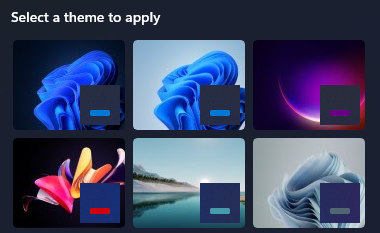
In my humble opinion, these are by far the best default wallpapers ever included with Windows. I’m in love. In fact, on my work machine, I’m using the default dark theme wallpaper! The dark mode is dark, and it applies to everything, which is great. I also turned transparency back on (something I’ve long kept off), and they’ve improved the aesthetic of transparency greatly. When I’m active in a window, it has a nice shine to it. Other windows sort of “fade away” in the background, much like the background of a photo.
The Start Menu
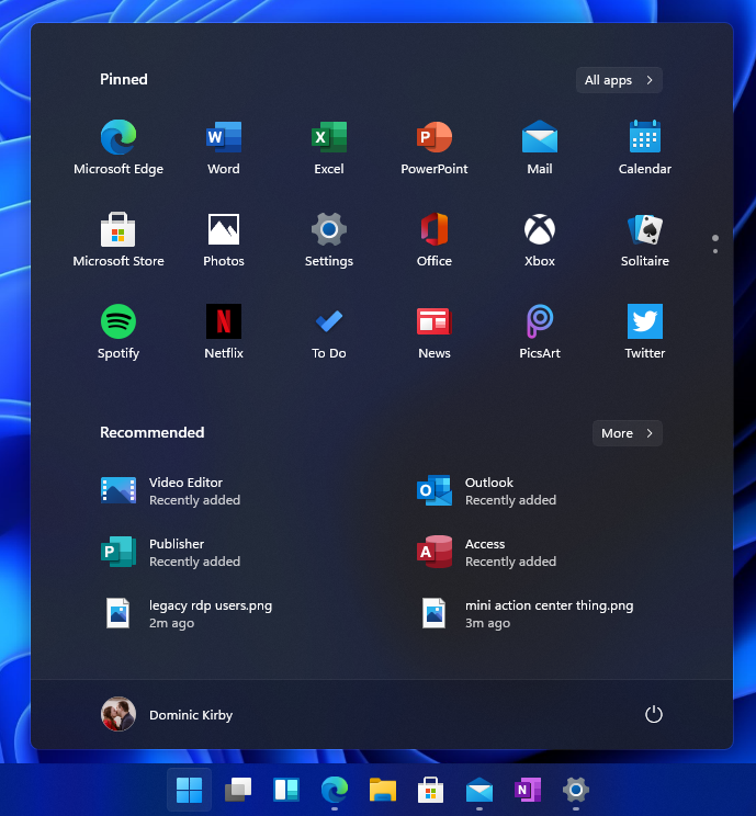
Boy is there some controversy around this. A centered taskbar is… jarring at first. But I’m going to leave it and see if it grows on me. So far, I’m in a “I don’t mind it” state. I think it can grow on me, and the centering doesn’t mess up my clicking because I almost always use the Windows key to get into Start. I can see how it will mess with folks who typically click it though.
Moving onto the layout of the menu itself. Live tiles are out! It’s sort of bittersweet, I was one of probably barely a handful of dorks who rock a couple of live tiles 🤷. Your pinned apps are right up top, where you’d expect them to be. And, just like in Windows 10, I can smack the Windows key and start typing to get what I’m looking for. The “Recommended” section is a nice blend of recently used/installed apps and recently accessed files. So far, I like it (granted I haven’t worked on many files yet).
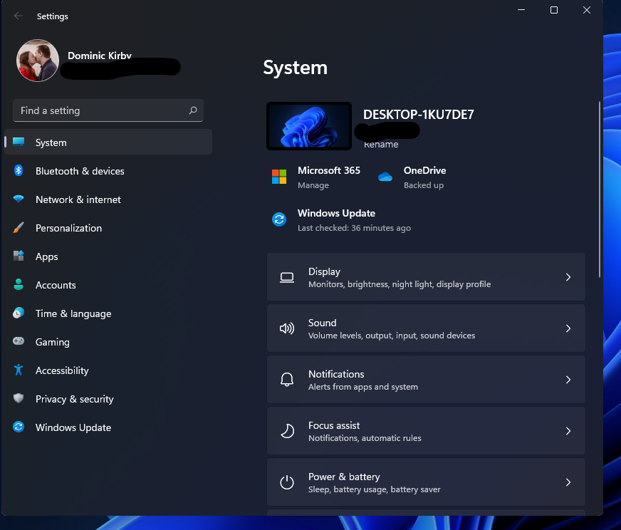
Settings… FINALLY
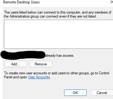
One of everyone’s biggest gripes about settings in Windows 10 is that it’s an odd mashup of modern and legacy. They’ve come so far, and I found myself able to dig deep into specific settings right within this refreshed settings app. Sure, it looks a bit like macOS and some Linux desktop environments, but who cares?! They’re taking user feedback and UI inspiration and making it Windows like. I’m a huge fan of this. You can even enable Remote Desktop (though you shouldn’t) right from within the settings app. If you try real hard though, you’ll find legacy settings. I’m sure it’s being worked on. One example of this is designated users authorized for RDP.
The important thing to note about modern settings is that the common “end user” settings I could thing of have all been modernized.
Other Elements
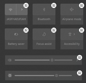
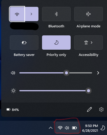
Streamlined Quick Settings
This is another “little thing” they’ve thought of that I absolutely love. Click the area for network connection, audio, and battery brings up a really nice, central spot type of UI for these settings:
The extra coolness of this little pop-out is that you can customize it, not unlike Android’s quick settings:
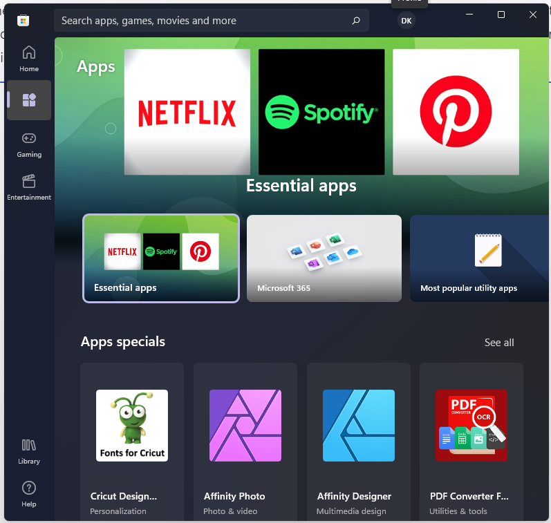
Store
I’m really excited for the new Microsoft App Store. Central app procurement is where the world is going, and Store and Store for Business are central to that. Now, it’s safe to assume, that this is a super early preview of the new store so I’m not going to dig into it much here. That said, the current rendition is really nice looking:
Widgets
Did you use Gadgets in Vista/7? Me neither! Widgets bring back the spirit of those, but it’s more refined. Widgets slide nicely from the left and let you customize them in a way that makes sense for you, but they stay out of the way when you don’t need them. I like that. I’m the kinda guy who doesn’t check the weather in the morning, but will check it when I am about to head out. Having that in a click is handy.
I also don’t watch the news, I mean who does?! Customizable feeds in the Widgets function do the trick for me to quickly catch up only on things I care about.
Rounded Corners
It’s the little things in life. -Someone smarter than I
I couldn’t understand the hype here. But it’s a subtle difference that makes things feel….. smoother. They’re welcoming, and they help present windows you have open as an object.
Snap Layouts
It’s only been a couple of minutes… ease up on me. I tinkered with snap layouts one time, and it works exactly as I’d expect. I’m definitely going to dig into this feature. I use the Fancy Zones from the Power Toys collection today, so I know I’m going to love Snap Layouts!
All For Now!
That sums up my first few minutes on Windows 11 Insider. I think Microsoft is making huge progress in making Windows a sleeker, more refined OS for the masses. I’m really looking forward to digging in more. I first plan to test as a personal user (with my Microsoft Account), and then I’ll dig more into Enterprise functionality next.